Dealing With Feedback and Criticism

Feedback and criticism are critical processes in web design, development and programming. It may seem like this technology is analytical with fairly clear answers to problems, but all of it is a more creative process than it looks.

In a recent episode of their excellent podcast Syntax, Scott Tolinski and Wes Bos discussed some approaches for developers and programmers dealing with criticism and feedback. Given that many developers are introverted and analytical, these soft skills are often confusing, frustrating and hard to parse. Our culture also reinforces the notion that criticism is always negative and should be taken personally. In fact, it’s likely that most friction and fighting in teams, between developers and clients, and so on, can be attributed to participants taking criticism personally.

I’d like to share some observations on this topic. I come at this as a developer with 23 years experience and even more experience in IT and working as a librarian.

How Criticism Should Be Shared (Negative and Positive)

It’s unfortunate that most people conflate criticism with negative feedback. In any kind of creative process, such as web development, design and programming (or the arts), criticism should include positive and negative words. It’s possible that criticism may be mostly negative or mostly positive, but constructive criticism usually involves a range of both.

This is one of the most important things I learned during art school, which I’ve always tried to mindfully apply to web design and development.

For example, let’s say you are looking at a new web design for the first time. It’s going to help the designer(s) and/or developer(s) to hear what you think works and what you think doesn’t work. You should outline the parts that you think work. You may say that the fonts look great. You like the overall color scheme. You like the masthead. On the other hand, you might point out that the masthead should be smaller, or placed differently. You may explain you need the elements on the home page placed differently. The slideshow should be moved down and the intro text featured more prominently.

Don’t Take Criticism Personally

This is probably something many of us techies hear, but practical application of this is harder to manage. When you’ve put hours of work into coding or a website design, it feels like it’s a personal thing. When you receive criticism, especially negative criticism or words that indicate some ignorance by the client, it’s easy to slip into a position of defending your work. But in the end, it’s just work. You are doing the work for somebody else, so the goal is to make them happy or make them feel like your work, or solution, matches their goals and priorities.

One effective psychological concept that helps you not take criticism personally is the idea and practice of detachment. There is a large amount of resources on detachment and how you can implement it mindfully in your work life. In the end, you want to do good work, get paid, and not have to think about work stuff when you aren’t working. Detachment is a great tool for developing healthy work-life balances.

Don’t Assume You Know What Other People Are Thinking, Or Their Motives

Mind reading is a skill that none of us possess. While you can “read” another person to some extent, it’s always smarter to engage the other person(s) in discussion and questions. It’s always possible that somebody may not say everything on their mind. They may be undecided. Have their mind elsewhere, like on a personal crisis. They may withhold feedback, thinking they are sparing your feelings. They may lack confidence in expressing themselves or sharing critical remarks. But if you focus on a smart feedback discussion, you will usually get most of the information that you need.

A quality feedback session doesn’t happen without some planning. While you may be able to wing a casual session with a client or team member who you’ve known for years, it is worth it to plan which topics you want to talk about. Prepare some questions. Make a list of items that you need feedback or criticism about.

They May Be Asking The Wrong Question, or, Are On A Different Page

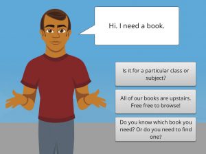
I bring one method from librarianship to feedback interactions with peers, co-workers, clients, and team members. That’s a method called “the reference interview.” Wikipedia explains it:

A reference interview is a conversation between a librarian and a library user, usually at a reference desk, in which the librarian responds to the user’s initial explanation of his or her information need by first attempting to clarify that need and then by directing the user to appropriate information resources.

The methods are explained:

Parts of a reference interview

The reference interview is structured to help the librarian provide answers to the library user. In general, the interview is composed of the following stages.[3]

  1. Welcoming
  2. Gathering general information from the user and getting an overview of the problem
  3. Confirming the exact question
  4. Intervention, such as giving information, advice or instructions
  5. Finishing, including feedback and summary

These stages may occur in loops, for example when a clarification of the question leads to the need to establish more background information on the query topic. These steps are designed to put the user at their ease, and then help ensure that they have correctly explained what they require. When the reference librarian believes that the query is fully understood, they attempt to provide resources that help satisfy it. An important and often overlooked final step is checking that the information or service provided was indeed what the library user required.

I find it useful to be mindful of this concept and be ready to use some of these methods, because they make feedback and criticism sessions more efficient and empowering. When criticism and feedback sessions are unstructured or too casual, conflicts arise from assumptions about what other people are saying.

When It’s Time For A Divorce

There will come times that despite your best efforts to communicate smartly, be detached from the project, and accommodate the client’s requests, that you just have to walk away from a difficult client. You may have explained why things should be done certain ways, based on your professional experience and skills, but the client just insists on sticking with a bad decision. Sure, they are the client and they are paying for the solution that you know is bad, but there will be other factors that prompt the divorce process. These can include everything from missed or late payments, to constant uncompensated design changes beyond the contract terms, to mercurial temper tantrums on the phone or via emails, and clients who delay and obstruct the launch or ending of a project.

Good luck!

13 Essentials for Successful Restaurant Websites

One of the critical things today for restaurant success is a quality website that presents the restaurant’s brand and is easy to use by customers. An effective restaurant website puts the best foot forward for the business, is helpful to customers and turns customers into repeat customers and evangelists for your business. Too many restaurants rely on having just a Facebook page or a website that is too wrapped up in its own design to be useful for your customers.

What are the essential design components of an effective restaurant website. In rough order of importance, starting with the most important:

  1. Display Hours, Address and Phone Number Prominently Featured – Unlike many websites out there, the goal of a restaurant website is not to keep the visitor lingering and spending time on the website. You want to turn every visitor into a customer, who makes a decision to visit your restaurant in person or place an order. Most of your customers are seeking quick information about your restaurant’s hours, address, phone number, menu options and prices. We put this critical decision info at the top of the website (except for menu information). A customer who is visiting your website is either a returning customer or somebody who has already decided to patronize your restaurant. Some restaurant web designer hide contact information, hours and phone number at the bottom of a home page. Often in the footer, or even on a secondary page. Don’t put obstacles in the way of customers who want to spend money at your restaurant.
  2. Mobile Friendly – It’s critical that your restaurant website look awesome on mobile devices. Over 50% of Internet users view websites on mobile devices. The numbers are probably much higher for people looking for restaurant information. A mobile friendly design should look and function like an app, not look like a miniature version of your site. Your customers should not need to pinch and expand to zoom in on your website.
  3. Menus – Customers visiting your website should not expect to be presented with a PDF of your physical menu as their first contact with the menus. Menus should be pages on your site or a section of text and pictures. Customers don’t like having to wait for a PDF file to open. Many tablets and mobile devices are poorly configured to display PDF files. Sure, it’s awesome that you’ve spent money on a nice menu design. You can always set up the menu PDF as an optional link at the bottom of your menu page or pages.
  4. Highlight special features of your menu – Do you have gluten free, vegetarian, vegan or other special options on your menu? Highlight these on your website menus. You can also create separate pages for these options on your website, where you explain in detail why these options are available.
  5. Phone Number should initiate phone call – The phone number listed prominently at the top of your website should start a phone call for any customer touching the number on their mobile device. Commonly, a customer looking up info on your restaurant is going to be somebody in their car, often with family or friends. “Call the number for the restaurant!” “Siri. Call Big City American Cafe.” Your website designer can set this up easily.
  6. Actual Website and not just social media page – There are so many restaurants out there that don’t have websites and only have a page on Facebook. Even worse are places that have nothing and are only represented online by a Google or Yelp listing. Branding your business effectively is Marketing 101. Your restaurant has to have its own website so you can market your brand on your terms. Your customers also want a website where they can expect answers to any of their questions. Facebook also doesn’t show all of your posts to all of your customers. An actual website is an important way of having more control over your interactions with customers.
  7. Pictures! A restaurant is a visual experience. There is the food. The decor. The staff. Special events. The neighborhood. All of these things lend themselves to making a restaurant website visually fresh and exciting. With the widespread availability of excellent cameras on smart phones, you and your staff should be constantly taking pictures for the website. Food photography can be trickier, but you’d be surprised at some of the excellent pictures you can get with a little practice, good lighting and an eye for presentation.
  8. Testimonials and Reviews – Share the words of your customer fans and local critics. Testimonials are a sign you are doing things right and give word-of-mouth more authenticity.
  9. Mailing List – A smart restaurant owner is always looking to turn customers into repeat customers and regulars. You should be looking to sign them up to a mailing list so you can mail them a regular newsletter, special offers, and news about special events. Your website is a perfect place to get customers to sign up for a mailing list. You should also have sign-ups in your restaurants, even with cards on tables. We recommend either Mailchimp or Constant Contact for mailing list cultivation and management.
  10. Reservation Services – Set up a third party reservation system like Bookatable to generate reservations, especially for large groups. Many of these services are free or affordable and integrate easily with your website.
  11. Show Off Your Personality – One of the drawbacks with a Facebook page is that your page looks like everything else, even with pictures. A website gives you a chance to show off your restaurant, food, staff, cooks and neighborhood. A restaurant website helps you brand your online presence and facilitates your digital marketing. Your website should also have a design that reflects the style of your cuisine and not be some boilerplate theme offered by some discount hosting.
  12. Specials and Offers – Your website should present your specials and offers. This give you more room to explain an offer. You can also create individual landing pages for offers where you can track how people are learning about your business.
  13. Analytics – This is a fancy way of saying keeping track of who visits your website. You are probably familiar with using customer feedback cards in the restaurant to collect information about your customers. Your website should be set up with Google Analytics so that you can gather information about customers AND people who were interested but haven’t decided to visit yet. Analytics can give you information about where people are visiting from, which might suggest a part of your city where traditional advertising should be targeted. You can find out which devices customers are using. Which pages they visit the most. How many people are clicking on your special offers pages.

Having a website is essential for restaurant success and we hope this helps you do it even better.

Photographer: Ali Yahya

Related Links